Yesterday, Matthew Griffith released a new package for animation in Elm called elm-animator.
This package is a successor to Matthew's previous animation package, elm-style-animation.
It provides a better mechanism for managing animation state in the model, as well as the ability
to generate CSS keyframe animations and animations via inline styles.
To begin with, I wanted to see how it would play along with elm-ui, and to create
an example of animating several properties across multiple widgets, because it wasn't
immediately obvious to me how to manage the corresponding state.
Hopefully this post can serve as an introduction to elm-animator whether you use
elm-ui or not – the basic principles are the same!
Combining CSS keyframe animations with elm-ui isn't straightforward, so I'm going to use
an approach that relies on an onAnimationFrame subscription.
The example I'm trying to create is similar to my previous post on animation with Animate.css:
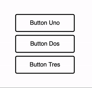
Buttons are going to switch between two states, but with animation:
type State
    = Default
    | Hover
We'll need some messages to trigger the changes:
type Msg
    = RuntimeTriggeredAnimationStep Time.Posix
    | UserHoveredButton Id
    | UserUnhoveredButton Id
The animation step message is needed for animation calculations. It's produced by a subscription as you'll see in a moment.
Model
The model shows the approach to animation state management in elm-animator. The state
related to animation can simply be wrapped in Animation.Timeline, so there's no
clutter in the model like extra fields specifically for animation state:
type alias Model =
    { buttonStates : Animator.Timeline (Dict Id State) }

init : () -> ( Model, Cmd Msg )
init _ =
    ( { buttonStates =
          Animator.init <|
              Dict.fromList [ ( "Uno", Default ), ( "Dos", Default ), ( "Tres", Default ) ]
      }
    , Cmd.none
    )
In init, I just need to wrap the actual initial value in an Animator.init call.
Subscription to onAnimationFrame
Next, I need to set up a subscription that will drive the animations, producing
RuntimeTriggeredAnimationStep messages. This requires defining an "animator":
animator : Animator.Animator Model
animator =
    Animator.animator
        |> Animator.watchingWith
            .buttonStates
            (\newButtonStates model ->
                { model | buttonStates = newButtonStates }
            )
            (\buttonStates ->
                List.any ((==) Hover) <| Dict.values buttonStates
            )

subscriptions : Model -> Sub Msg
subscriptions model =
    Animator.toSubscription RuntimeTriggeredAnimationStep model animator
I've taken a slightly more advanced approach to defining the animator, using
Animator.watchingWith rather than Animator.watching, because watchingWith
allows me to control when the subscription runs (as opposed to having it running all
the time). The arguments are as follows:
- The first argument describes how to get the animation timeline from the model
- The second argument describes how to update the animation timeline in the model
- The third argument is a predicate that defines when the animation subscription should run.
This is needed, in particular, for continuous animation of so-called "resting states",
where there is no transition happening between the underlying state of the model.
In my case, I only want the subscription to run when at least one button is in
Hoverstate, which would allow me to provide a continuous animation of the button under cursor.
Model updates
Now it's time to handle messages and make state transitions:
update : Msg -> Model -> ( Model, Cmd Msg )
update msg model =
    let
        maybeAlways value =
            Maybe.map (\_ -> value)

        setButtonState id newState =
            Dict.update id (maybeAlways newState) <| Animator.current model.buttonStates
    in
    case msg of
        RuntimeTriggeredAnimationStep newTime ->
            ( Animator.update newTime animator model
            , Cmd.none
            )

        UserHoveredButton id ->
            ( { model
                | buttonStates =
                    Animator.go Animator.slowly (setButtonState id Hover) model.buttonStates
              }
            , Cmd.none
            )

        UserUnhoveredButton id ->
            ( { model
                | buttonStates =
                    Animator.go Animator.slowly (setButtonState id Default) model.buttonStates
              }
            , Cmd.none
            )
Essentially, in response to RuntimeTriggeredAnimationStep I update the animations,
and in response to UserHoveredButton I set the corresponding button state to Hover and
also trigger the hover animation with Animator.go Animator.slowly. Lastly, in response
to UserUnhoveredButton I'm changing the button state back to Default and triggering
the reverse animation.
Button rendering
The last part of the task is to render the buttons, using the values of animated properties
supplied by elm-animator. I'm going to animate background color and font size
of the hovered button, and also flip the border and font color without animation.
Here is the code:
buttons : Model -> Element Msg
buttons model =
    let
        buttonState id =
            Maybe.withDefault Default <| Dict.get id <| Animator.current model.buttonStates

        borderColor id =
            fromRgb <| Color.toRgba <|
                if buttonState id == Hover then
                    Color.blue

                else
                    Color.black

        fontColor id =
            fromRgb <| Color.toRgba <|
                if buttonState id == Hover then
                    Color.white

                else
                    Color.black

        bgColor id =
            fromRgb <| Color.toRgba <|
                Animator.color model.buttonStates <|
                    \buttonStates ->
                        if (Maybe.withDefault Default <| Dict.get id buttonStates) == Hover then
                            Color.lightBlue

                        else
                            Color.white

        fontSize id =
            round <| Animator.linear model.buttonStates <|
                \buttonStates ->
                    Animator.at <|
                        if (Maybe.withDefault Default <| Dict.get id buttonStates) == Hover then
                            28

                        else
                            20

        button id =
            el
                [ width <| px 200
                , height <| px 60
                , Border.width 3
                , Border.rounded 6
                , Border.color <| borderColor id
                , Background.color <| bgColor id
                , Font.color <| fontColor id
                , Font.size <| fontSize id
                , padding 10
                , onMouseEnter <| UserHoveredButton id
                , onMouseLeave <| UserUnhoveredButton id
                ]
            <|
                (el [ centerX, centerY ] <| text <| "Button " ++ id)
    in
    [ "Uno", "Dos", "Tres" ]
        |> List.map button
        |> column [ spacing 10, centerX, centerY ]
This function shows two elm-animator functions:
Animator.color, which interpolates colorsAnimator.linearwhich interpolates numeric values
All I need to do is supply the final values associated with the button states, and
elm-animator supplies all the intermediate values.
There is a bit of a hiccup with colors. elm-animator uses the avh4/elm-color package
for its Color type and related functions, but elm-ui has its own internal Color type.
It's likely that elm-ui will also use avh4/elm-color in the future, but for now
I need to do a conversion using fromRgb << Color.toRgba. I also do the same transformation
in borderColor and fontColor, even though these attributes aren't animated,
because it's convenient to use predefined colors like Color.blue from avh4/elm-color.
Finally, this is the full program (also available in this Ellie):
module Example.AnimatedButton exposing (..)

import Animator
import Browser
import Color
import Dict exposing (Dict)
import Element exposing (..)
import Element.Background as Background
import Element.Border as Border
import Element.Events exposing (..)
import Element.Font as Font
import Html exposing (Html)
import Time


type State
    = Default
    | Hover


type alias Id =
    String


type Msg
    = RuntimeTriggeredAnimationStep Time.Posix
    | UserHoveredButton Id
    | UserUnhoveredButton Id


type alias Model =
    { buttonStates : Animator.Timeline (Dict Id State) }


animator : Animator.Animator Model
animator =
    Animator.animator
        |> Animator.watchingWith
            .buttonStates
            (\newButtonStates model ->
                { model | buttonStates = newButtonStates }
            )
            (\buttonStates ->
                List.any ((==) Hover) <| Dict.values buttonStates
            )


init : () -> ( Model, Cmd Msg )
init _ =
    ( { buttonStates =
          Animator.init <|
              Dict.fromList [ ( "Uno", Default ), ( "Dos", Default ), ( "Tres", Default ) ]
      }
    , Cmd.none
    )


subscriptions : Model -> Sub Msg
subscriptions model =
    Animator.toSubscription RuntimeTriggeredAnimationStep model animator


update : Msg -> Model -> ( Model, Cmd Msg )
update msg model =
    let
        maybeAlways value =
            Maybe.map (\_ -> value)

        setButtonState id newState =
            Dict.update id (maybeAlways newState) <| Animator.current model.buttonStates
    in
    case msg of
        RuntimeTriggeredAnimationStep newTime ->
            ( Animator.update newTime animator model
            , Cmd.none
            )

        UserHoveredButton id ->
            ( { model
                | buttonStates =
                    Animator.go Animator.slowly (setButtonState id Hover) model.buttonStates
              }
            , Cmd.none
            )

        UserUnhoveredButton id ->
            ( { model
                | buttonStates =
                    Animator.go Animator.slowly (setButtonState id Default) model.buttonStates
              }
            , Cmd.none
            )


buttons : Model -> Element Msg
buttons model =
    let
        buttonState id =
            Maybe.withDefault Default <| Dict.get id <| Animator.current model.buttonStates

        borderColor id =
            fromRgb <| Color.toRgba <|
                if buttonState id == Hover then
                    Color.blue

                else
                    Color.black

        fontColor id =
            fromRgb <| Color.toRgba <|
                if buttonState id == Hover then
                    Color.white

                else
                    Color.black

        bgColor id =
            fromRgb <| Color.toRgba <|
                Animator.color model.buttonStates <|
                    \buttonStates ->
                        if (Maybe.withDefault Default <| Dict.get id buttonStates) == Hover then
                            Color.lightBlue

                        else
                            Color.white

        fontSize id =
            round <| Animator.linear model.buttonStates <|
                \buttonStates ->
                    Animator.at <|
                        if (Maybe.withDefault Default <| Dict.get id buttonStates) == Hover then
                            28

                        else
                            20

        button id =
            el
                [ width <| px 200
                , height <| px 60
                , Border.width 3
                , Border.rounded 6
                , Border.color <| borderColor id
                , Background.color <| bgColor id
                , Font.color <| fontColor id
                , Font.size <| fontSize id
                , padding 10
                , onMouseEnter <| UserHoveredButton id
                , onMouseLeave <| UserUnhoveredButton id
                ]
            <|
                (el [ centerX, centerY ] <| text <| "Button " ++ id)
    in
    [ "Uno", "Dos", "Tres" ]
        |> List.map button
        |> column [ spacing 10, centerX, centerY ]


view : Model -> Html Msg
view model =
    layout [ width fill, height fill ] <|
        buttons model


main : Program () Model Msg
main =
    Browser.element
        { init = init
        , update = update
        , view = view
        , subscriptions = subscriptions
        }
Animating a resting state
Earlier, I mentioned that I used Animator.watchingWith in order to control when
the subscription to onAnimationFrame is active, and to be able to animate resting
states.
Now I can use that to make the button label continue to pulsate while it's in Hover
state:
Note that the background color animation happens once, but the font size continues going up and down.
To achieve this, I only need to change the fontSize function in buttons:
fontSize id =
    round <|
        Animator.move model.buttonStates <|
            \buttonStates ->
                if (Maybe.withDefault Default <| Dict.get id buttonStates) == Hover then
                    Animator.loop (Animator.millis 1000) <| Animator.wave 20.0 28.0

                else
                    Animator.at 20.0
Now, when the button is in Hover state, instead of Animator.at 28, I'm returning
Animator.loop (Animator.millis 1000) <| Animator.wave 20.0 28.0 which produces
an infinite loop of font sizes moving along a sine curve from 20 to 28px.
Final thoughts
I like the way elm-animator manages state and keeps the overhead of managing animations
to a minimum. I also like that it solves the problem in a very general way.
There's a lot more to elm-animator, and in this post I only scratched the surface
of what it can do. Its ability to generate CSS keyframes is particularly interesting
from a performance perspective, and I hope one day it will also become available
in elm-ui.