In addition to the two hardest problems in computer science — cache invalidation and naming things — I would add one more, which is dealing with user input via forms.
Somehow, forms tend to evolve into a tangle of interdependencies between fields and byzantine validation rules. "This field is optional based on particular values of three other fields, and not shown at all if another checkbox is selected (but we still want the corresponding value to be calculated as an average of these two other fields)" — that kind of thing.
So I was interested in checking out a package for building forms called hecrj/composable-form.
It has a lot going for it. This is what its README says about the kind of forms you can make:
- Composable: they can be extended and embedded in other forms.
- Type-safe: everything is safely tied together with compiler guarantees.
- Maintainable: you do not need view code nor a message for each form field.
- Concise: field validation and update logic are defined in a single place.
- Consistent: validation errors are always up-to-date with the current field values.
- Extensible: you can create your own custom fields and write custom view code.
Impressive!
Let's build a registration form then.
Keep in mind that I can only scratch the surface of the functionality offered by this package in this post — and it turned out quite long as it is!
Our registration form is going to have the following fields:
- An optional name
- Email address
- Password
- Repeat password
- A list of plans for the user to select
- A checkbox for the user to agree with the terms
This package cleanly separates the visual representation of the form from everything else (data types, validation, field attributes etc.).
Let's define some types.
We are going to need two types: one to represent the raw values that are used to populate the inputs in the form, and one to hold the validated output of the form (possibly of different types). Here they are:
type Plan
    = Basic
    | Pro
    | Enterprise


type Email
    = Email String


type Password
    = Password String


type alias InputValues =
    { name : String
    , email : String
    , password : String
    , repeatPassword : String
    , plan : String
    , agreedToTerms : Bool
    }


type alias UserDetails =
    { name : Maybe String
    , email : Email
    , password : Password
    , plan : Plan
    }
UserDetails represents the output of the form. Note that it no longer contains strings, and holds a subset of the input fields (because we don't need things like the repeated password to go to the server).
How about the fields now?
Since composable-form is all about composition, each field definition is a mini-form unto itself, and each of the field definition functions like emailField and passwordField returns a Form values output value. These mini-forms can then be assembled into a more complex form.
Let's start by defining the name field:
nameField =
    Form.textField
        { parser = Ok
        , value = .name
        , update = \value values -> { values | name = value }
        , attributes =
            { label = "Name"
            , placeholder = "Your name"
            }
        }
The parser field is a validation function that returns a Result String output value. In this case, we are doing no validation by assigning Ok.
value specifies how to get the raw value from this field from the relevant record. In our case, it's InputValues which has a name field so we're using the .name accessor function.
Correspondingly, update specifies how to perform an update of InputValues when the field value changes.
Lastly, attributes is where you specify things like field label and placeholder to display inside.
If you recall, this field is supposed to be optional, but this isn't reflected in this field definition. We will deal with optionality when we compose all the fields into a single form.
OK, and what about the email field? Here it is:
parseEmail s =
    if String.contains "@" s then
        Ok <| Email s

    else
        Err "Invalid email"


emailField =
    Form.emailField
        { parser = parseEmail
        , value = .email
        , update = \value values -> { values | email = value }
        , attributes =
            { label = "Email"
            , placeholder = "you@example.com"
            }
        }
For this field, I provided a validation function parseEmail. Note that it's responsible for converting the raw input into an output value of the correct type as well (in this case, Email).
The password field can be defined similarly:
parsePassword s =
    if String.length s >= 6 then
        Ok <| Password s

    else
        Err "Password must be at least 6 characters"

passwordField =
    Form.passwordField
        { parser = parsePassword
        , value = .password
        , update = \value values -> { values | password = value }
        , attributes =
            { label = "Password"
            , placeholder = "Your password"
            }
        }
The repeat password field is more of a mind bender, because validating it requires the value of the first password field. composable-form has a function called Form.meta which allows us to deal with such fields:
repeatPasswordField =
    Form.meta
        (\values ->
            Form.passwordField
                { parser =
                    \value ->
                        if value == values.password then
                            Ok ()

                        else
                            Err "The passwords must match"
                , value = .repeatPassword
                , update =
                    \newValue values_ ->
                        { values_ | repeatPassword = newValue }
                , attributes =
                    { label = "Repeat password"
                    , placeholder = "Repeat password"
                    }
                }
        )
Form.meta takes a function which receives InputValues as its argument, and we define the field inside it, wherein the validation function can access the first password value. Since we don't actually need the repeat password beyond the validation stage, we return Ok () if the passwords match.
Finally, the plan selector and the "Agree to terms" checkbox can be defined in a similar fashion to other fields:
parsePlan s =
    case s of
        "Basic" ->
            Ok Basic

        "Pro" ->
            Ok Pro

        "Enterprise" ->
            Ok Enterprise

        _ ->
            Err "Invalid plan"


planSelector =
    Form.selectField
        { parser = parsePlan
        , value = .plan
        , update = \value values -> { values | plan = value }
        , attributes =
            { label = "Choose a plan"
            , placeholder = "Choose a plan"
            , options =
                [ ( "Basic", "Basic" )
                , ( "Pro", "Pro" )
                , ( "Enterprise", "Enterprise" )
                ]
            }
        }

termsCheckbox =
    Form.checkboxField
        { parser =
            \value ->
                if value then
                    Ok ()

                else
                    Err "You must accept the terms"
        , value = .agreedToTerms
        , update = \value values -> { values | agreedToTerms = value }
        , attributes =
            { label = "I agree to terms and conditions" }
        }
And now to assemble the form...
If you've used the NoRedInk/elm-json-decode-pipeline package or the elm/parser package, the process of assembling the form will look familiar.
form : Form InputValues UserDetails
form =
    Form.succeed
        (\name email password plan _ ->
            UserDetails name email password plan
        )
        |> Form.append (Form.optional nameField)
        |> Form.append emailField
        |> Form.append
            (Form.succeed (\password _ -> password)
                |> Form.append passwordField
                |> Form.append repeatPasswordField
                |> Form.group
            )
        |> Form.append planSelector
        |> Form.append termsCheckbox
We start with Form.succeed whose argument is a function that's going to receive all of the validated values. Then we build up the field list using a pipeline of Form.append calls.
There are a few other details worth pointing out.
If we weren't dropping the boolean agreedToTerms flag, then we could have started the definition with a Form.succeed UserDetails.
Note that the name field line is |> Form.append (Form.optional nameField). Form.optional returns Nothing if all the fields in the form given to it are empty, and Just output otherwise. So it will produce Maybe String that we need in UserDetails.
We are grouping the password fields with the help of Form.group. This function doesn't change the behaviour of the form, but it provides information to the renderer, which may choose to render the grouped fields in a particular way (in our case, the two password fields will show up side by side).
Also, same as we did with agreedToTerms, we're dropping the repeatPassword value in the process of defining this group by writing Form.succeed (\password _ -> password).
How do we show this form on a page?
So far we've fully defined what data in the form and the validation rules. The next step is to render it on the page. composable-form includes a renderer, Form.View.asHtml, which generates an Html msg value from a Form. We can define the view like this:
view : Model -> Html Msg
view model =
    Form.View.asHtml
        { onChange = FormChanged
        , action = "Sign up"
        , loading = "Signing up"
        , validation = Form.View.ValidateOnSubmit
        }
        (Form.map Signup form) model
We need to supply a config record, which specifies the message generated when the content of the form changes. This message carries a Form.View.Model InputValues value. The action field specifies the label of the submit button. loading specifies the text shown when the form is put into a loading state (eg when waiting for a server response). Lastly, validation specifies whether to run validation on form submit or on blur.
The second argument to asHtml is a Form values msg value, where the message is the one that carries the validated output of the form (in our case, UserDetails).
The last argument is the state of the form, which has the type Form.View.Model InputValues here.
Consequently, the Msg type has to be defined like this:
type Msg
    = FormChanged (Form.View.Model InputValues)
    | Signup UserDetails
The model, for this toy application, is just the state of the form, and the initial state can be defined with the help of Form.View.idle:
type alias Model = Form.View.Model InputValues

init =
    Form.View.idle
        { name = ""
        , email = ""
        , password = ""
        , repeatPassword = ""
        , plan = "Pro"
        , agreedToTerms = False
        }
In update, we need to update the state of the form in response to FormChanged:
update : Msg -> Model -> Model
update msg model =
    case msg of
        FormChanged newForm ->
            newForm

        Signup _ ->
            model
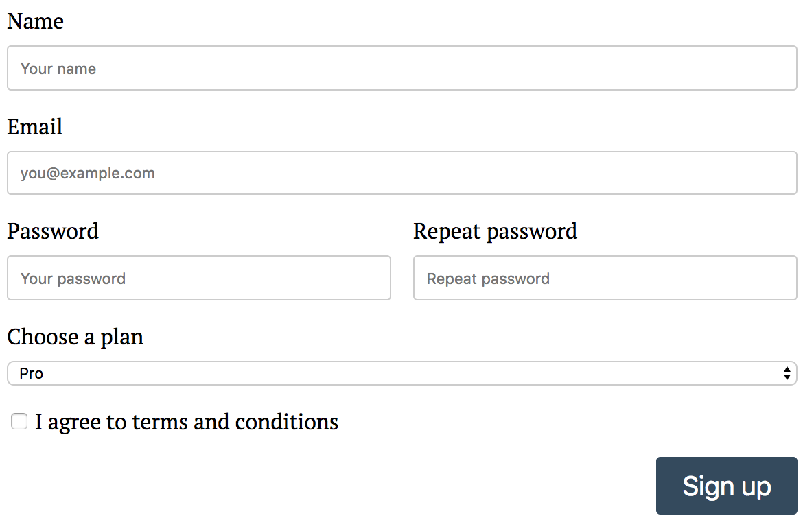
And that's it! Well, almost. We also need to define some styles (composable-form doesn't go beyond generating HTML), and of course handle the Signup message to do something useful. With some styling, our form renders like this:

Here is an Ellie with all this code put together: https://ellie-app.com/42ncDhHfsYxa1.
What about validation?
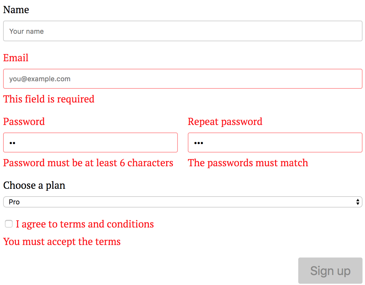
This is automatically handled by the package, as we've already provided validation rules and messages. If I try to submit an empty form, I'm going to see this:

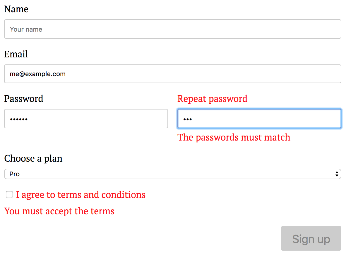
After the first failed submit, individual messages are added/removed dynamically as I provide input in the form:

The "Sign up" button stays disabled until all inputs pass validation.
What else can it do?
It's also possible to build custom fields and custom form renderers (for example, there are elm-ui-based views in the live demo for the package). Form fields can change dynamically based on user input. Multi-stage forms are possible. I'm not going to talk about these features in this post, however.
Good stuff, but can I have something simpler?
Actually, yes. If user input in your application isn't particularly complicated, the rtfeldman/elm-validate package might suit your needs. It allows you to build a validator for data stored in the model, and is completely agnostic with regards to how your views are built. I demonstrate how to use this package in my book, Practical Elm. Oh, and the book will also show you several options for building UIs. Check it out!