Creating UIs with CSS is rarely as straightforward as you expect.
A few weeks ago I wanted to make the navigation on my site responsive, having it switch from a row of links to a hamburger slideout menu. Seems like a reasonable thing to do with CSS, right?
Not really. As often happens, I tried a few reasonable things -- they didn't work. I started searching for solutions -- most involved JavaScript.
I finally found a solution that was CSS-only, and then spent a couple of hours trying different combinations of styles to get it to (mostly) work in the context of my site.
How many times did you find yourself doing something totally reasonable that should be simple with CSS, only to find yourself getting derailed in bizarre ways? Maybe the text just won't align vertically, or you just can't seem to get the width of the elements right, or the style you've added doesn't seem to have any effect at all.
That seems to be a common experience with CSS, which is why I'm excited about an Elm package called elm-ui. Its goal is to allow you to build UIs in pure Elm, with HTML and CSS generated for you behind the scenes.
The approach taken by elm-ui is based on four ideas:
- Getting the compiler to verify as much of the layout and styling as possible by defining them in Elm code
- Enabling all of the reuse and refactoring capabilities of Elm for UI code
- A simplified approach to styles and, in particular, layout; styles are specified locally for each element.
- Context independence: elements and their attributes are expected to behave the same regardless of the surrounding context (which is often not the case for CSS).
In elm-ui, all of the layout and visual styling is done within your view function, with the "gross morphology" of layout made explicit through the functions exposed by this package. Style attributes can be specified for each element in the layout.
Making a start
To see elm-ui in action, let's implement a simplified version of the Slack UI:
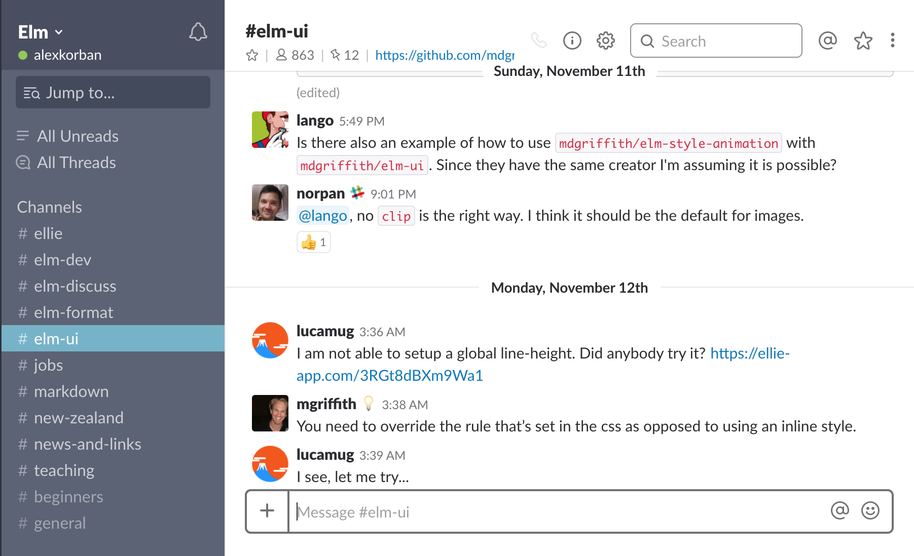
First off, let's initialise the project:
$ elm init
$ elm install mdgriffith/elm-ui
Then, let's make the smallest increment towards our layout:
module Main exposing (main)

import Element exposing (..)
import Element.Background as Background
import Element.Border as Border
import Element.Events exposing (..)
import Element.Font as Font
import Element.Input as Input
import Html exposing (Html)

channelPanel : Element msg
channelPanel =
    column
        [ height fill
        , width <| fillPortion 1
        , Background.color <| rgb255 92 99 118
        , Font.color <| rgb255 255 255 255
        ]
        [ text "channels" ]


chatPanel : Element msg
chatPanel =
    column [ height fill, width <| fillPortion 5 ]
        [ text "chat" ]


main : Html msg
main =
    layout [] <|
        row [ height fill, width fill ]
            [ channelPanel
            , chatPanel
            ]
Here is the page produced by this code:
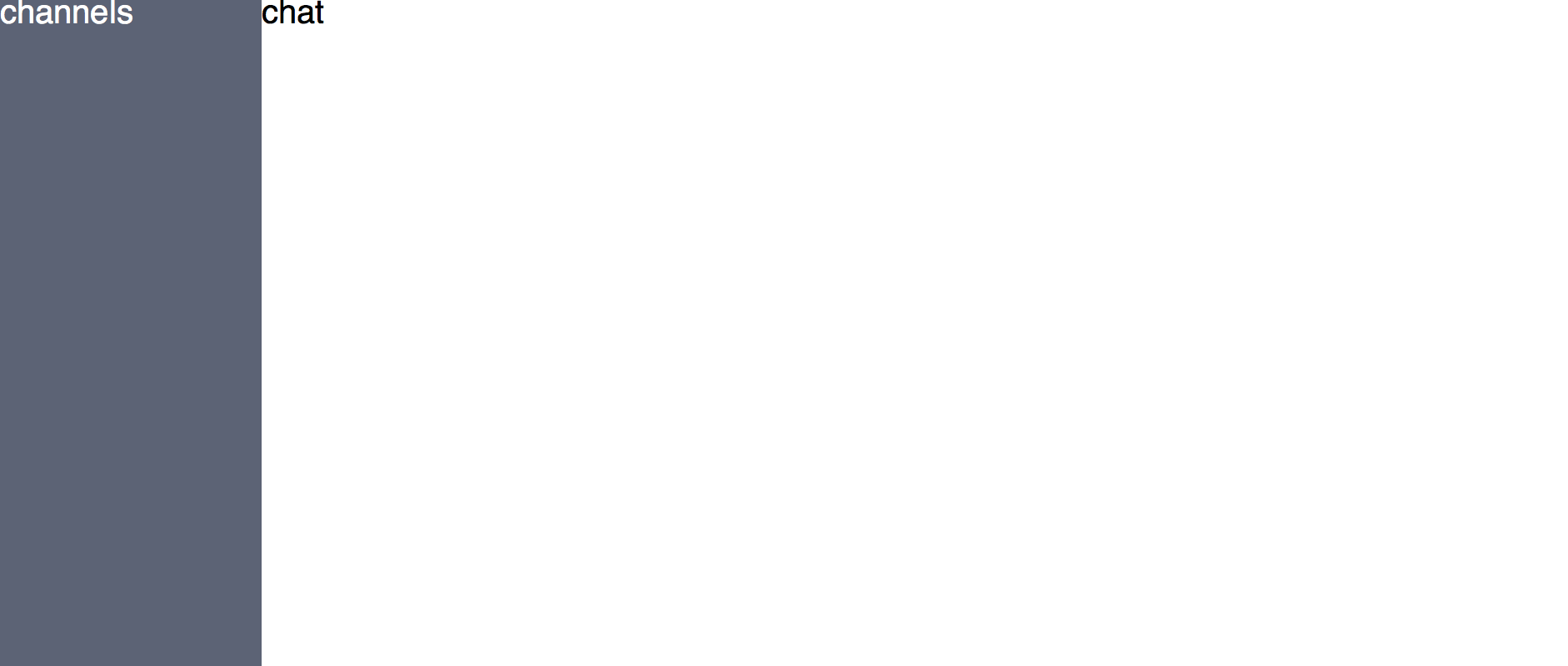
There is enough code here to demonstrate the main concepts of elm-ui.
In main, I used the layout function. Its main purpose is to convert from Element msg (the return type of elm-ui layout functions) to Html msg which we need to use with Browser functions like Browser.document.
Since we have two panels side by side -- channels on the left, chat messages on the right -- I used the row function which arranges its child elements in a row.
The first argument to this function is a list of attributes. Here, I used height fill and width fill to make it fill the height and width of the viewport.
I've also used a couple of attributes for visual styling (Background.color and Font.color).
The second argument is a list of children -- in our case, channelPanel and chatPanel.
You'll notice that the definitions of channelPanel and chatPanel are similar, except there I used the column functions since their child elements are arranged vertically.
Both of them need to fill the full height of the parent element. As far as width goes, I allocated 1 part of the total width to the channel list and 5 parts to the chat by using fillPortion.
Finally, I specified the background and font colors for the channel panel.
Simple, right?
Combining rows and columns in this fashion is surprisingly versatile (although these are not the only layout functions on offer).
Filling in the channel list
Next, let's show a list of channels, highlighting the active channel:
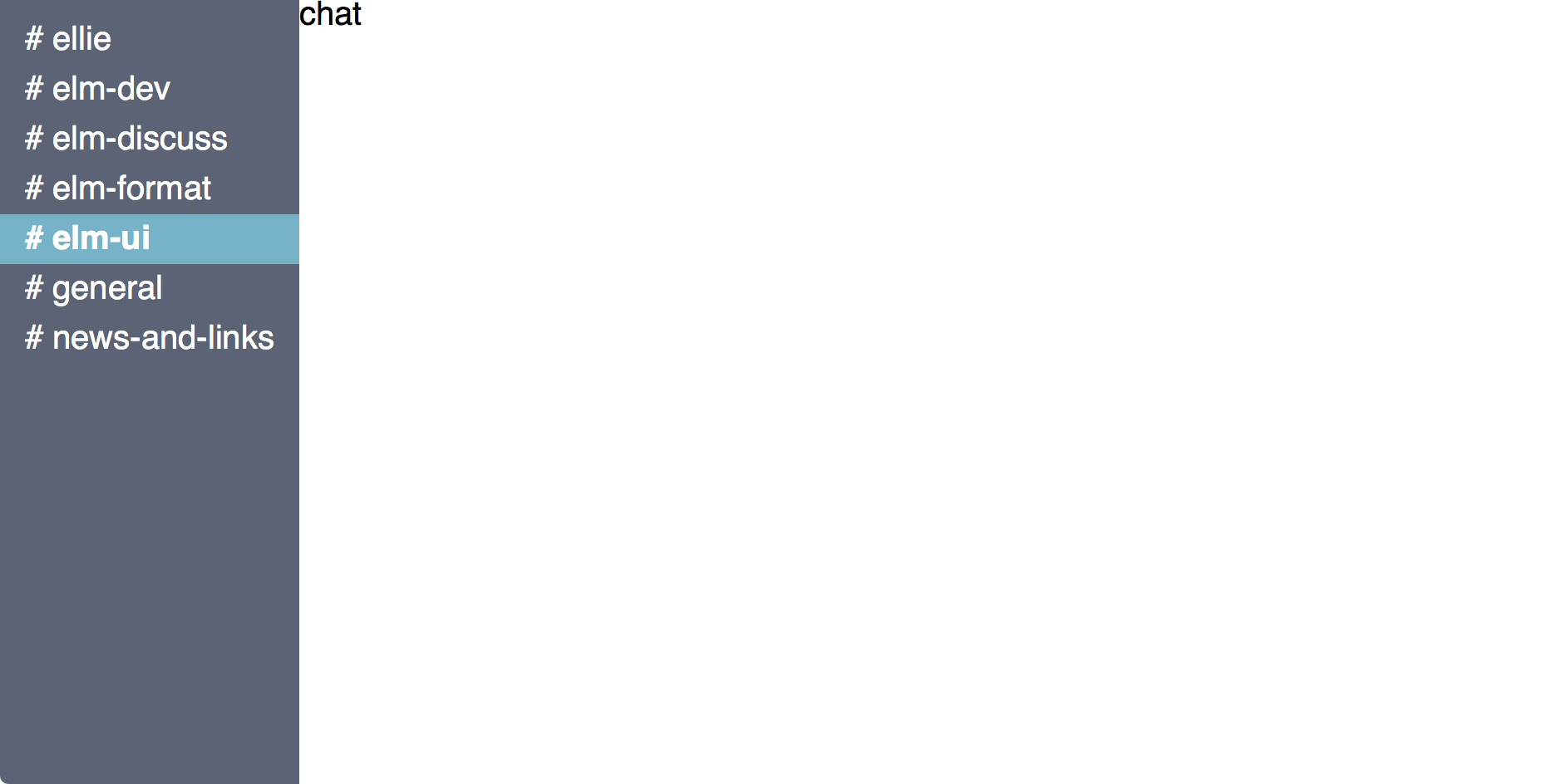
This is how we can implement this:
channelPanel : List String -> String -> Element msg
channelPanel channels activeChannel =
    let
        activeChannelAttrs =
            [ Background.color <| rgb255 117 179 201, Font.bold ]

        channelAttrs =
            [ paddingXY 15 5, width fill ]

        channelEl channel =
            el
                (if channel == activeChannel then
                    activeChannelAttrs ++ channelAttrs
                 else
                    channelAttrs
                )
            <|
                text ("# " ++ channel)
    in
    column
        [ height fill
        , width <| fillPortion 1
        , paddingXY 0 10
        , Background.color <| rgb255 92 99 118
        , Font.color <| rgb255 255 255 255
        ]
    <|
        List.map channelEl channels
The main component of this function is channelEl in the let. In it, I use el, which is a generic element, the basic building block in elm-ui -- kind of like div in HTML. I specify different attributes based on whether the channel is the active channel. This function is mapped over the list of channels.
Header and footer sections in the channel
Next, we can start filling in parts of the content area:
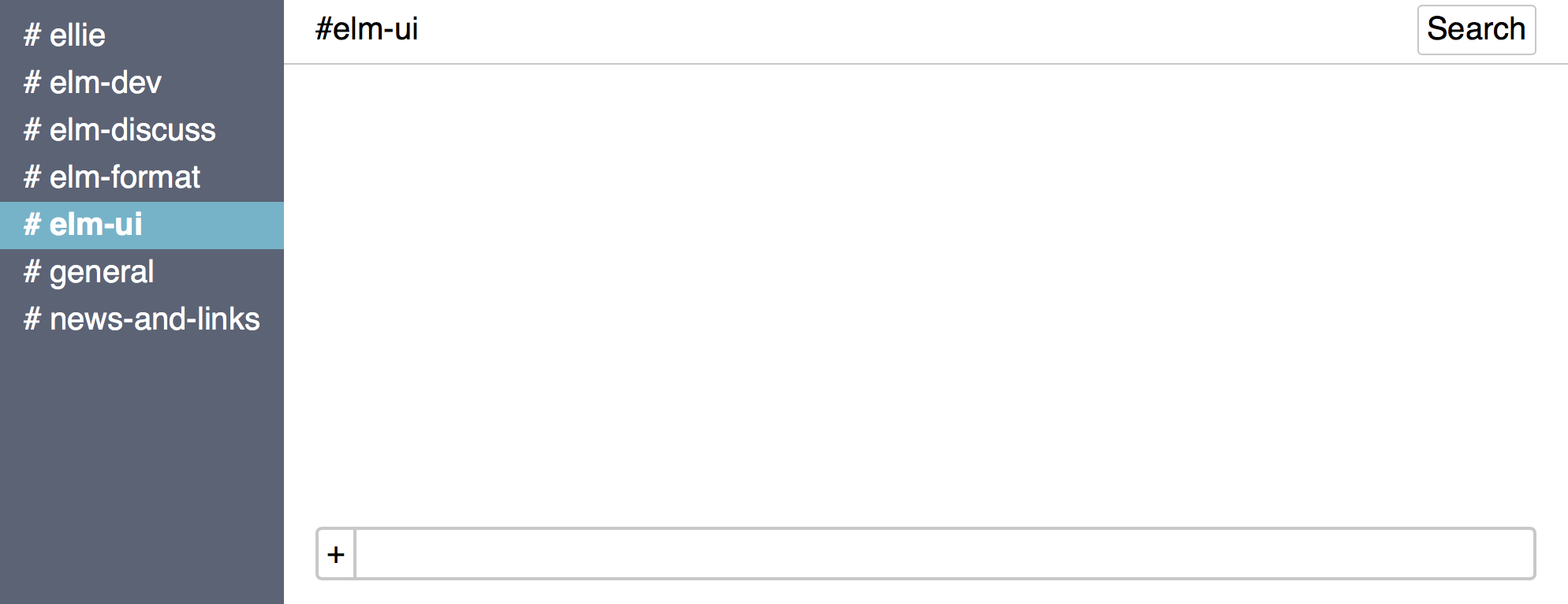
The corresponding code looks like this:
chatPanel : String -> Element msg
chatPanel channel =
    let
        header =
            row
                [ width fill
                , paddingXY 20 5
                , Border.widthEach { bottom = 1, top = 0, left = 0, right = 0 }
                , Border.color <| rgb255 200 200 200
                ]
                [ el [] <| text ("#" ++ channel)
                , Input.button
                    [ padding 5
                    , alignRight
                    , Border.width 1
                    , Border.rounded 3
                    , Border.color <| rgb255 200 200 200
                    ]
                    { onPress = Nothing
                    , label = text "Search"
                    }
                ]

        messagePanel =
            column [] []

        footer =
            el [ alignBottom, padding 20, width fill ] <|
                row
                    [ spacingXY 2 0
                    , width fill
                    , Border.width 2
                    , Border.rounded 4
                    , Border.color <| rgb255 200 200 200
                    ]
                    [ el
                        [ padding 5
                        , Border.widthEach { right = 2, left = 0, top = 0, bottom = 0 }
                        , Border.color <| rgb255 200 200 200
                        , mouseOver [ Background.color <| rgb255 86 182 139 ]
                        ]
                      <|
                        text "+"
                    , el [ Background.color <| rgb255 255 255 255 ] none
                    ]
    in
    column [ height fill, width <| fillPortion 5 ]
        [ header
        , messagePanel
        , footer
        ]
At first glance, this might look like a lot of code, however note that it's really straightforward, and most of it is simply layout and styling attributes. At the bottom of the function, it's very clearly stated that we have vertically arranged header, messages and footer.
The definitions of header and footer are very readable, and conceptually simple. I'm still combining rows and columns, with a sprinkling of padding and spacing, plus some visual styling like colours.
By the way, elm-ui does away with the rather troublesome concept of margins and padding that's found in CSS. Instead, you can specify internal padding for an element, and you can also specify the spacing between its child elements. I find this much more intuitive.
All I needed to do to attach the footer to the bottom was to give it the alignBottom attribute.
Messages
The last thing we need to implement is the message panel. We want it to take up the available screen space, and to scroll when there are more messages than fit on the screen:
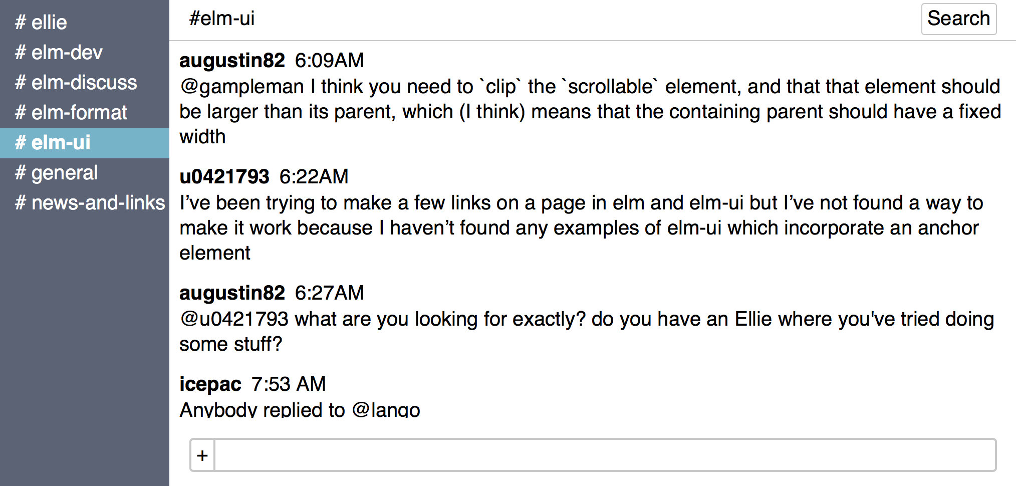
We have to make chatPanel take a list of messages as its argument, and to flesh out messagePanel in its let clause:
type alias Message =
    { author : String, time : String, text : String }

...

chatPanel : String -> List Message -> Element msg
chatPanel channel messages =
    let
        header =
            ...

        messageEntry message =
            column [ width fill, spacingXY 0 5 ]
                [ row [ spacingXY 10 0 ]
                    [ el [ Font.bold ] <| text message.author, text message.time ]
                , paragraph [] [ text message.text ]
                ]

        messagePanel =
            column [ padding 10, spacingXY 0 20, scrollbarY ] <|
                List.map messageEntry messages

        footer =
            ...
    in
    column [ height fill, width <| fillPortion 5 ]
        [ header
        , messagePanel
        , footer
        ]
In defining messageEntry, I used a new function called paragraph. This function lays out its children as wrapped inline elements. In this case there's only one child - the message text, but I still need it to wrap.
Also note that the column in messagePanel has the scrollbarY attribute -- this is what prevents it from pushing the footer beyond the bottom edge of the viewport.
There is one more change required to constrain the whole layout to the viewport (rather than having the messages extend it further down past the fold). The top level layout needs to have height fill in its attributes:
main : Html msg
main =
    layout [ height fill ] <|
        row [ height fill, width fill ]
            [ channelPanel sampleChannels sampleActiveChannel
            , chatPanel sampleActiveChannel sampleMessages
            ]
And that's it! The whole thing is 150 lines of code -- not bad for a non-trivial layout, and it's very clear code to boot, with no HTML or CSS in sight.
As far as implementing this goes, the only thing that stymied me for a short while was making the messages scroll without pushing the footer down. I found the rest of the layout very straightforward to convert into code, which is rather unlike my experience with CSS. I think this is a great strength of elm-ui.
Like what you've seen of elm-ui so far?
In my guide, elm-ui: The CSS Escape Plan, I walk through all of elm-ui features, demonstrate how to get it to work with various types of content such as forms, Markdown and custom elements, and give some suggestions on code organisation.
Next steps
I encourage you to try this package out! The documentation is here: elm-ui documentation. There is a dedicated channel for elm-ui on Elm Slack too: #elm-ui.
You can see the full code from this post in Ellie: https://ellie-app.com/3TdcKSPxMv5a1. (You'll need to widen the output pane to see the whole layout, unless you have a large screen.)
Try making a few small changes to the layout in Ellie. Could you right-align channel names? Could you move the channel name to the centre of the header area? Could you add user icons to messages?
I've also created a showcase of elm-ui examples where you can get sample code for various controls and layouts.
In the elm-ui section of Elm Catalog, you can find all the elm-ui-specific packages such as Orasund/elm-ui-widgets and fabhof/elm-ui-datepicker.
Finally, Matthew Griffith gave a talk on the motivation for creating elm-ui and the difficulties with CSS, which you might find interesting: Building a Toolkit for Design